Started thinking about how summer’s almost over. Then about school starting soon. Of course, that got us thinking about buying school supplies. Then about wandering the stationery aisle for an hour trying to decide on the perfect pen (before buying a ten pack of Bic black ballpoints). All of which got us thinking about handwriting. And fonts. So now that you understand our labyrinthian thought process, check out all the cool typography links we’ve been geeking out on the last couple weeks.
Speaking of Labyrinths
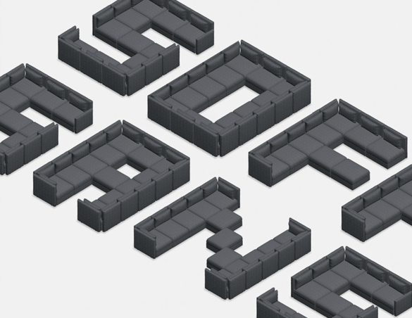
Have you ever wondered what a font made out of modular sofa pieces would look like? Yeah, neither have we. First the background. Ikea implemented a sofa-planning tool on its website. Twitter, of course, took it to another level, posting elaborate, sometimes absurd sofa creations (including one with a drawbridge). In response, Ikea created Soffa Sans, “the world’s comfiest font.” If you’re interested in downloading the font, you can do so here. If you’re interested in recreating it with Ikea furniture, go to the nearest ATM and withdraw $135,000.
P.S. Ikea also just changed its standard typeface to one that will function in almost any global market they expand into. You can read about the font that is called “the most universal typeface in existence” here.
One Font to Rule Them All
Over the past couple years, variable fonts have been gaining in popularity. There’s a lot to love about them, not the least of which are customization and size. Instead of being limited to the styles made available by the font creator (and needing storage space on your drive to hold fonts with several styles), with variable fonts one small file allows you to create a font style unique to your needs. Obviously, the choices aren’t completely unlimited, but the fonts come with thousands of axes (up to 64k) of variation. Variable fonts also give you the flexibility to play with the font’s weight, width, slant, etc. to create a varied look rather than having to find separate fonts that pair well together. Of course, one last thing we love is that there is a variable font named Avenir Next.
What’s Your Type?
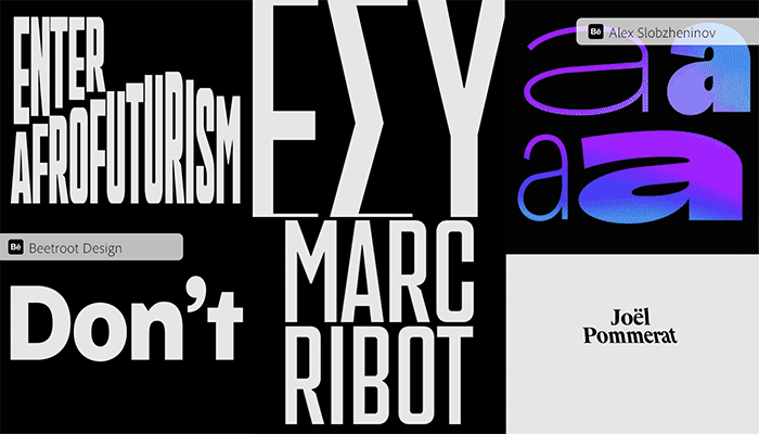
It’s an exciting time in typography (yes, we just typed that sentence). Brands and designers are using typefaces as an integral part of telling their story. For that reason, we’re starting to see some very creative typography. We’re not even going take too much time describing the latest trends because you really have to see them to appreciate their awesomeness. We’ve already talked about variable fonts (you can see and download more of them when you click the above link). Other trends include 3D type, handwritten fonts and outlined fonts. This article gives you the chance to see and download examples of each.
The Game’s a Font
Who doesn’t like playing games at work? Don’t raise your hand. We don’t really want to know. However, if you do like playing games at your desk, we have a few here for you that will not only look like you’re actually working but will sharpen your typography skills and knowledge in the process. The first one is Kern Type. You have to realign the letters in a word to space them properly. Great for honing your proofing skills. In TypeWar, you look at a letter and decide which of two fonts it is. Way harder than it sounds, but also maybe not as useful a skill as seeing letter spacing correctly. Finally, Type Connection lets you send two fonts on a “date” to see if they are compatible. If your matchmaking skills are Yenta-level, not only do you win but you end up with a font pairing you can use in your next project.
This Typeface is Not Afraid to Take Up Space
You may have seen this on our LinkedIn page a couple of weeks ago, but it’s worth sharing again in case you missed it. As a response to a lack of representation for women in the typography industry, designer Marion Besserier created the Good Girl font. According to her, it’s named that because the font behaves nothing like a stereotypical “good girl”. It takes up a lot of space and even gets pushy when it feels like it. It’s chunky, with a 70’s feel to it. Unapologetic and a little brash. We love it. You go, girl! (is that still a thing?)
Finally
Fonts in Use is just a really cool repository font being used out in the world today. The projects are sorted by topics, formats, and typefaces. If you need some fontspiration, this is the place to go.
OK. We’re just about done typing (get it, typing … we crack ourselves up). Hit us up in the chatbox and let us know what you think of all this typography. The next time you hear from us, it will most likely be an update from Paris. Till then, au revoir.